Let’s pretend I’m your ideal customer. I’m interested in your products and services, and I’m getting ready to make a purchase. I’ve done some quick research online, and now I’ve got a few tabs open in my browser – one with your website and the rest with your competitors’. I’m flicking through each one, trying to decide which company to choose. I’ve arrived back at your website: Is it immediately clear why I should choose your company over your competitors?
If you’ve got a clear answer – congratulations! That’s your unique value proposition (UVP).
A UVP is the reason for your company to exist; your ‘Why’. It’s your sense of purpose, communicated in a way that aligns with your customers’ needs and wants. If it doesn’t resonate with your customers, then it’s not a true UVP. It’s not a mission, vision, or a core value, nor is it a slogan or tagline. It’s simply the reason why a customer should choose you in an ocean of choice.
All good digital marketing strategies should resonate with your UVP. From an acquisition point of view, every digital marketing channel needs to align and amplify your UVP to hook customers in, whilst your owned channels need to elaborate and prove your claims in order to convert customers.
As digital marketers, we’re able to test, measure, validate and improve on UVPs to increase conversions and maximise growth. We’ll show you how to do this the Yoghurt Digital way in 6 steps.
But first – what does a good UVP look like?
All good UVPs should answer the following questions:
Is it easy to understand?
Clarity is key. The more concise your value proposition statement is, the easier it will be to attract and convert customers.
Can you effectively and efficiently communicate your message?
According to Jakob Nielsen, a value proposition should be clearly communicated within 10 seconds. In our dopamine hit, multiple tabs world, your value proposition has to cut through the noise quickly. UVPs don’t have to be text – if imagery and videos do a better job, use them.
10 seconds is roughly enough time to digest everything above the fold, plus a little more. If your product or service is complex, than a video may be a better way of communicating your UVP to the user. Just make sure you hook your ideal customer within the first 10 seconds of the video to ensure they watch it all the way through.
What tangible benefit will your customer receive if they choose you?
If I purchase your products or use your services, I’ll want to know the tangible benefits. Case studies, social proof, testimonials, reviews, images of your products, before-and-afters, and time savings are good examples of tangible benefits.
The U in UVP – how are you different from your competitors?
When it’s so easy to research and compare options online, standing out and offering something different from your competitors becomes one of the most important elements of your unique value proposition.
If there are a hundred other businesses out there just like you, why should I choose you?

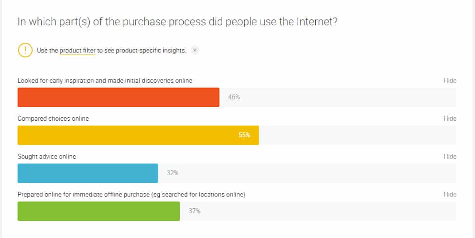
55% of Australian’s will compare different options online during the research and consideration phases.

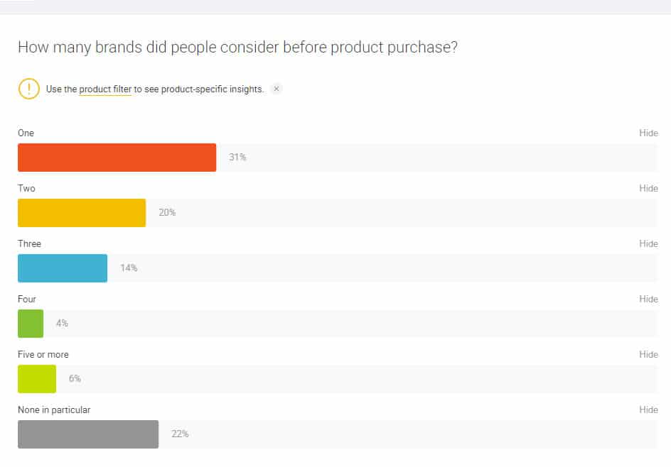
44% of Australians will compare at least 2-5+ brands before making a decision.
Here are a few examples of unique value propositions:
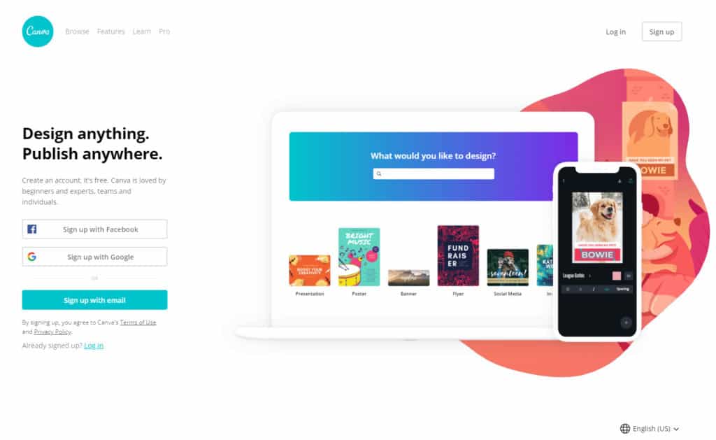
Canva

What works:
- As a whole, it’s easy to understand. The headline is clear and straight to the point, with the supporting paragraph of text calling out a target audience.
- The imagery matches the headline, showing some examples of what can be done and on what devices.
- “Create an account, it’s free” communicates that it’s risk-free and easy to get started.
What could be improved:
- “Loved by beginners, experts, teams or individuals” means everyone. This broad claim can potentially be improved by highlighting that Canva is a great tool for people looking to create professional designs, without a designer.
- Tangible benefits. This could be improved by saying, “Beautiful designs in minutes” or, “Design anything, without needing a designer”.
- SaaS websites benefit from showing images of the interface. An A/B test could be run on the homepage to replace the image with a short video that shows the design process from start to finish, just to show how easy it is.
Jira

What works:
- Not much when stacked against the four questions above.
What could be improved:
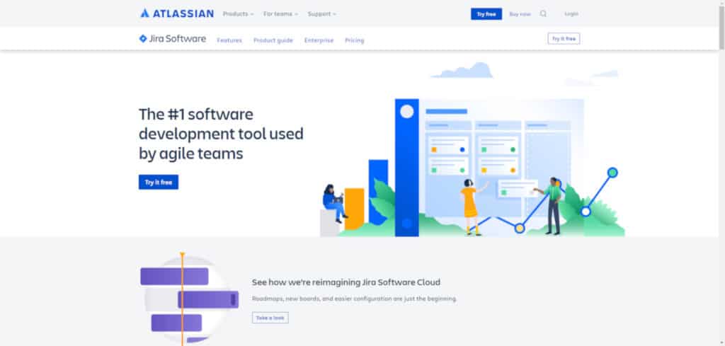
- It’s not clear what type of software development tool it is.
- It’s not clear why it’s better than other tools.
- The message wasn’t efficiently or effectively communicated. The imagery doesn’t reveal much except it’s a kanban board application.
- No tangible benefits are communicated to the user.
Keep in mind that I have absolutely no data to back up my assessment above. The best value propositions aren’t the ones that you and I decide on. Your customers will decide using their wallets.
When what you sell isn’t unique…
More often than not, e-commerce websites aren’t offering anything particularly unique in terms of products. Where you can really make a difference is in the shopping and customer experience. As competition grows and the barriers to entry into e-commerce continue to decrease, it becomes increasingly important to stand out from the crowd.
At a bare minimum, e-commerce websites need to offer the following:
Outstanding User Experience (UX)
- Is it easier to navigate your website than competitor websites to find products?
- Are buying guides or product comparisons offered?
- Is the purchasing process seamless?
- What is it that your customers really want from you?
All of these questions can be answered through user research. Intimately knowing your customers will help you focus on what matters most.
An example of this is Sparrow Flights. Whilst the product offering itself is not unique, it stands out from the crowd by offering exceptional user experience. We’ve all been through cumbersome flight and hotel booking systems before. Sparrow Flights streamlines and simplifies the experience, allowing you to book flights on your mobile device in under 60 seconds.
Outstanding Customer Experience (CX)
- Do you readily provide assistance and answer questions in a timely manner, across all your channels?
- Do you have a solid shipping and returns policy?
- Are you ensuring safety and keeping personal information private?
- Are you shipping items in a timely manner? Is it easy to track items?
An example of this is Zappos, who put CX above all else. Selling shoes online isn’t unique – it was their exceptional customer experience that set them apart not just from their competitors, but from every e-commerce player in the market at the time.
Retention & Loyalty
- Can you reward customers for choosing you?
- Can you offer better incentives for first-time purchasers?
- Can you incentivise repeat purchases?
- What value are you offering?
A problem we often come across is when a company wholesales to other retailers that resell their products. The manufacturer can’t match on pricing, so more often than not, customers end up buying from the reseller. What these manufacturers can do to stand out is to offer loyalty and rewards programs, exclusive online products and engaging content that adds additional value to their customer base.
So whilst there’s plenty of competitors, if you can offer outstanding UX and CX while offering extra value to your customers, you can still stand out.
Now that we’ve covered the basics of a UVP, let’s move on to testing, measuring, validating and continuously iterating your UVP in six steps:
Step #0: Starting From Scratch
If you’re starting with absolutely nothing, this short exercise is something we do at Yoghurt to get to know the companies we work with more intimately:
Fill In The Blanks
Company Name helps Customer Type(s) gain BENEFIT by offering Service/Product.
For example:
Version 1: Yoghurt Digital helps Marketing Managers, CMOs and Business Owners solve Digital Challenges by offering customer-centric and data-driven digital marketing strategies.
It’s a bit long-winded isn’t it? So let’s refine it further.
Version 2: Yoghurt Digital helps companies improve their digital marketing performance by offering customer-centric, data-driven digital strategies.
This UVP is still quite long but it’s a great starting point. The best way to hone this message further is through existing data.
Step #1: Existing Data
Every piece of data you have helps. If you’ve run any marketing campaigns in the past, it’s best to start there.
Previous Marketing Campaigns
Have a look at previously successful campaigns and find answers to these questions:
- What messaging did you use?
- Which landing pages did you send traffic to?
- Which campaigns weren’t successful, and what was the difference with the most successful campaign?
Analytics Data
You can glean plenty of insights on what your customers are looking for when reviewing Analytics. For example:
- Which channels are driving the most visits?
- What messages are being used for the most popular channels?
- Which pages have the most visits? A lot of information can be gathered by assessing the top pages. For example, if you have a lot of people visiting your ‘About Us’ page, then it’s likely that the team behind the company is an important factor for consumers.
When You Have No Data
If you’re just starting up then you might not have much data to rely on. Your best approach is to talk to friends and family. Treat it like an elevator pitch and make sure the message is understood.
Your next step is to do some quick competitor analysis to understand if your position is unique enough.
Step #2: Competitor Analysis
To understand where you sit in the market, take a look at some of your competitor websites and see if you can understand their UVP. List them all out and compare each one against the others.
- Who’s the market leader? Why? What makes them unique?
- Is there a gap in the market?
- How are you different from your competitors?
With these data-points in mind, it’s time to conduct user research.
Step #3: Conduct User Research
The best insights into why people should choose you come from both current and prospective customers. For deeper insights you would ideally talk to both segments and identify what turns a prospect into a customer.
Conducting user research doesn’t have to be a daunting task. There are several methods you can use:
Interviews – If you have the capability and time to recruit and interview current and potential customers, then interviews will allow you to get into the head of the customer. Ask open-ended questions, such as what drives their decision-making process and what pain points they face. Talk to three customers and three prospects first, noting their major differences and similarities.
If you’re getting the same responses after six interviews across both segments, then you can stop the interview process. If you’re finding patterns are continuing to emerge, then continue with 8-9 more interviews.
Surveys – When you want to quantify and understand the scope of an issue, a customer survey via email is the best way to go about it. Ask a handful of questions with a mix of open-ended and multiple choice for best results. You would ideally want a minimum of 100 responses, but the more the better (250+ is a decent sample size).
Analyse the responses across all your user research methods and take note of patterns.
Step #4: Constructing Themes
The next step involves reviewing the analysis of all your data sources across historical campaigns, analytics, user research and competitors to identify common themes and opportunities.
If you’re having trouble grouping your data points together, we suggest starting with the users first. Here are a few common examples of themes we see:
- User pain points and how you solve them
- User benefits and how you deliver them
- Quality of product
- Exceptional customer service
- Ease of use
Prioritise your themes by how many data sources support each of them. The more data sources, the higher the priority for testing.
Done? Excellent – let’s validate your thinking.
Step #5: Validation Using Google Ads
Google Ads is one of the most effective channels for you to test and measure your UVP messaging. That’s because:
- There’s almost always a competitor bidding. You are directly testing your UVP messaging for the top positions.
- You are limited to a total of 300 characters (including spaces), which force you to be succinct with your messaging.
- You only pay when someone is actually interested in the message you put out there. Unlike other acquisition channels, you can cap your budgets to suit your resources.
- You can measure click-through rate (CTR) as an expression of interest.
To test your messaging effectively, here are our best practices for writing ad copy:
- Start with the highest priority theme and build your campaign around it. We recommend sticking with two UVP content themes at a time for reliable and timely results.
- Create only three ads for each UVP theme. Create one headline test and one description line test to trial which combination drives the strongest results.
- Always ensure the ad copy you’re writing is relevant to the keyword you’re bidding against and always include the keyword in the ad copy. Whilst this can be challenging to do, you can test your UVP in the headline and keep keywords in the descriptions and URL paths.
- Set your ads to rotate evenly to ensure even visibility.
- You’re going to get a stronger result by bidding against generic, in market-based keywords rather than brand-specific searches. People who already know your brand will have a different mindset.
It’s highly advised to isolate CTR as the main KPI. We’re measuring interest in the message, not the conversion process (which could have many variables). This can be difficult to understand and communicate to stakeholders, so be prepared to explain the reasoning behind this process.
Ideally, we would take a scientific approach where changes are made in isolation and the impact measured. But in reality, performance matters. Not every business has the time or budget to do this properly. Measure revenue, profitability and conversions if it makes sense to do so. Just keep in mind you’ll need to do most of step six to ensure a better outcome.
- Your results should be statistically significant. The sample size of impressions and volume of clicks (or conversions) is important. You’ll want a minimum of 100 clicks or conversions. We don’t want to leave this up to chance, so we’re looking for a minimum statistical significance of 95% as well. This has to be balanced with budget and timeframes of course. You don’t want to be waiting six months to validate a single UVP. There’s no perfect formula that will work in all situations.
- Once the campaigns are live you’ll need to wait for the data to come in. Go through each theme and repeat this process until you’ve got a winner.
If you’ve made it this far, it’s time to ensure your landing page experience does everything possible to convert the user.
Step #6: Website Experience
The job of your website is to now convince the user to take action by expanding upon your winning message. Update your website to ensure you’re now answering the four questions that make a good UVP:
- Is is easy to understand?
- Can you effectively and efficiently communicate your message?
- What tangible benefit will your customer receive if they choose you?
- How are you different to competitors?
A/B test different methods of answering the four questions on your landing pages to measure the best results.
For best results, make sure you also:
Match your landing page copy to your ad copy: Everything you mentioned in your headline, description, site links and even URL paths – they all need to be found easily once the user lands on your website.
Have strong supporting evidence: Prove your claims through images, videos, testimonials, case studies and reviews.
Tick off the fundamentals: Ensure your website is usable, accessible and functional. Go through your website on mobile, tablet and desktop and across every major browser. Make sure everything works as intended on the combinations of devices and browsers.
Deeply understand your user: The initial user research in Step 3 was a good start, but we’re only scratching the surface of what’s possible. To go deeper, you need to truly understand users by conducting further quantitative and qualitative user research.
Bringing it all together
Your UVP is created, tested and validated. Your website resonates with your UVP. So what’s next?
You can now start pushing the same message across all your digital channels. Test, measure and learn using every channel. But remember… your UVP should form the basis of your entire digital marketing strategy. Never miss an opportunity to communicate your ‘Why’, so that even when a customer has ten tabs-worth of competitors open, you’ll be the clear winner.
If you’re keen to discover more ways to craft and communicate your UVP more effectively, get in touch with the team at Yoghurt Digital today.

