H&R Block
Increasing ReturnsHelping Australia's leading tax accountants build blocks of success
The Challenge
H&R Block completes over 700,000 tax returns in Australia every year. That’s a lot of customers. But the country’s leading tax firm was facing a problem: Their online visibility did not match their physical footprint. We were brought on board to help them transform their digital strategy and grow their market share.
With an incredibly complex project and rapid turnaround time, we had just six weeks in which to envision, build and launch H&R Block’s new strategy just in time for their busiest period - tax time.
Luckily, our team at Yoghurt love a challenge. These were the key barriers we identified that needed attention:
Website Design, Functionality & Content
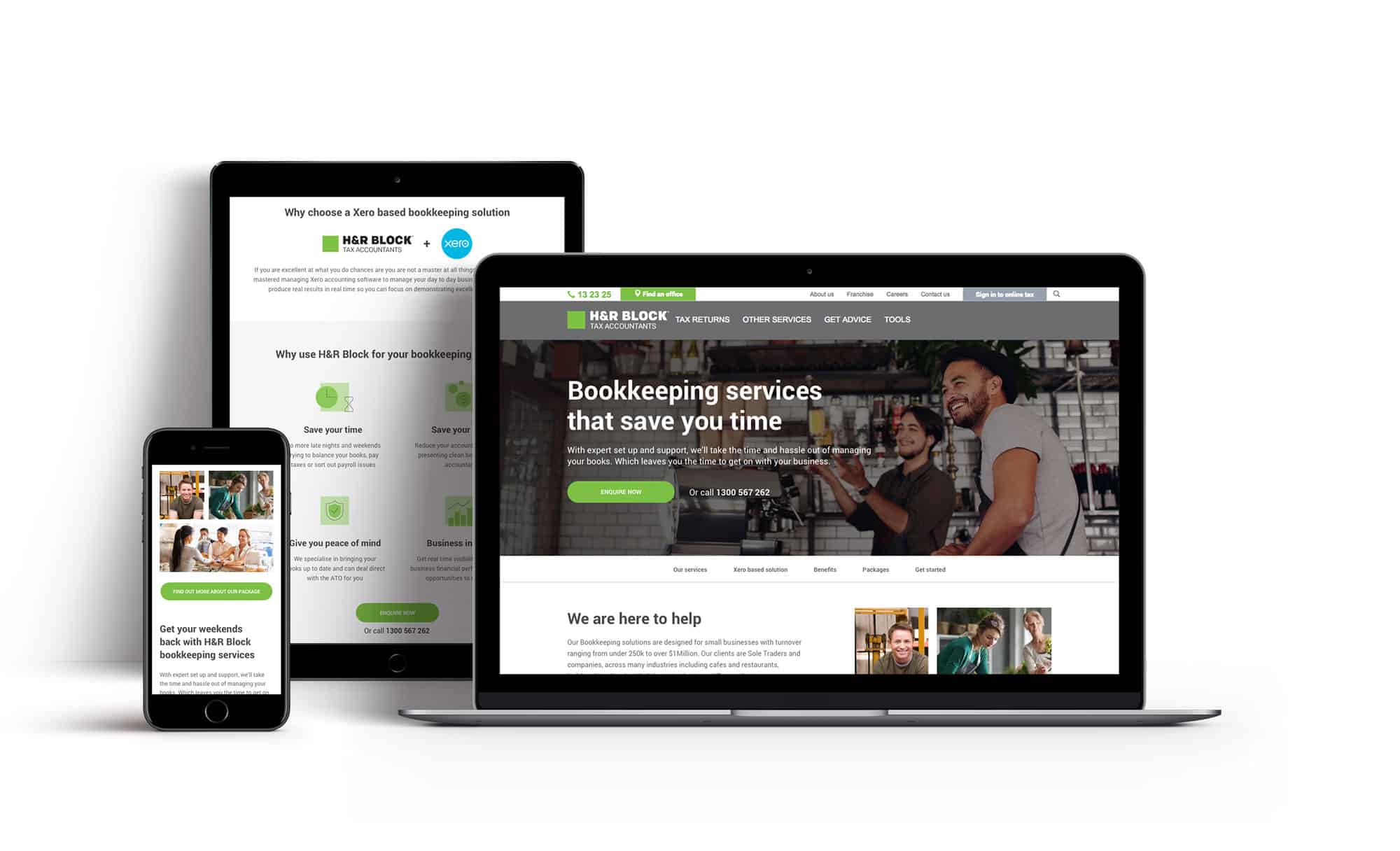
To maximise effectiveness, the H&R Block website required a complete overhaul. From a conversion funnel perspective, we needed to develop a clear path-to-conversion for website visitors - with clear, unique selling propositions that would serve to separate the company from their competition.
Location-Based Targeting
With almost 500 office locations around Australia, H&R Block has incredible reach across both metropolitan and rural areas. Yet the website’s structure did not allow users to easily find or book appointments at those locations. We identified that a restructure of this section with location-based targeting would have the biggest impact on visibility, traffic, conversions and, ultimately, H&R Block’s bottom line.
Biddable Strategy
In similar fashion to the website, the AdWords campaign also needed to be reworked. In six weeks we would need to build a new strategy, account structure, keyword list, ad creative, audience targeting, bidding strategy and budget allocation.

The Approach
While our remit was strictly limited to digital channels, H&R Block had an ecosystem of existing agencies covering advertising, creative, collateral, media buying, public relations and web development - all of whom we needed to collaborate and align our strategy with.
Website Design, Functionality & Content
Taking into account the short turnaround time, we made the decision to focus on the pages that drove the highest volumes of traffic and played the most critical roles in the customer's path-to-conversion.
As a starting point, we rebuilt the entire office locator user journey. We redesigned not only the individual page templates, but also improved the overall flow and added new functionality. We also updated popular pages such as the core ‘tax returns’ page, ‘in office’ page, ‘DIY’ page, the main navigation bar and the tax calculator. From a content perspective, we rewrote content to better fit audience interests and expectations.
We A/B tested all of our proposed designs to validate whether or not our approach would generate a meaningful performance uplift. We also tested the various new features to monitor engagement rates, and to determine if their usage had a positive correlation with conversion rates.
Once all of the tests were completed and we had successfully validated our hypothesis, we shared the new designs with the web development agency for implementation.
Location-Based Targeting
Next, we worked closely with H&R Block’s web development agency to redesign the form and function of the entire office locator section of the website. We ensured that every office location had its own dedicated page on the website, with information on the services they offer, opening hours, how to book an appointment, and a list of local H&R Block offices.
From an SEO perspective, this transformation had an immediate impact - allowing H&R Block to rank far more strongly for location-based search terms, dramatically improving their organic visibility and driving significantly more traffic.
From a biddable perspective, we now had specific landing pages to send traffic to. Thanks to the geo-targeted and location-based campaigns we built, customers could now be sent to a relevant landing page with a clear path-to-conversion, rather than being pushed to the home page.
Biddable Strategy
Here, our first move was to restructure the account, refining the keyword list and breaking keywords out into their own individual ad groups where needed. This gave us visibility on performance at an individual keyword level, while also allowing us to have highly targeted landing pages for each keyword.
This change increased the quality score of the entire account and gave us improvements in click-through rates, engagement rates and cost-per-click. This structure also meant we could see which keywords were underperforming at any given moment. We significantly reduced budget wastage and increased overall conversions by pausing or removing poor performing keywords immediately, and funneling spend into the top-performing keywords.
We implemented the testing of ad creative, ensuring that each ad group had three pieces of creative on rotation at all times. Given H&R Block's broad range of persona profiles, plus their respective needs and pain points, ad creative testing was vital in order to identify which unique selling propositions H&R Block were relevant to each persona. This led to impressive improvements in click-through rates across the campaigns.
Finally, thanks to our work around UX and SEO to improve location-based search results, we were able to heavily reduce the budget of the brand campaigns and let the organic search results pick up that traffic. We instead put a renewed focus on attracting new customers by increasing the budget put towards generic search terms.
I've had the pleasure of working with Yoghurt Digital for the last couple of years. They were instrumental in updating our website and implementing best practice SEM and SEO to drive growth for our business. Their friendly and professional team are flexible enough to adapt quickly to client needs and are a pleasure to work with!

